“The greatest value of a picture is when it forces us to notice what we never expected to see”, – John Tukey
It is a general observation that 80% of the most critical meetings end sooner than the prescribed time and on a positive note when the data is presented in a pictorial/ graphical format rather than regular alphanumeric. This is primarily because assessment and understanding happen sooner and decision-making becomes more efficient.
Heat Maps have been one of the popular graphical elements that have been successfully utilized to induce vivid presentations. They are a way to represent data in a color-coded manner. Normally the X and the Y axes represent two elements and the relationship between the two is represented by the intensity of the colors. Businesses popularly use Heat Maps to represent sales, revenue, the concentration of the target audience, etc.
Heat Maps is one of the most significant offerings of Maplytics, the preferred geo-mapping app of Microsoft AppSource for integration maps with Microsoft Dynamics 365 CRM / Dataverse (Power Apps)
Working-
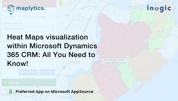
Clicking on the Heat Map command button within the Accounts Tab of Maplytics within Dynamics 365 CRM will bring up the Heat Map Screen.

Select Datasource:
This option helps the user to choose an Entity and view combination to analyze the data.
Select Measure:
This helps the user to define the aggregation method to be used to color code the region. By default, it is based on the number of records (i.e. ‘By Count’). The user can change this to any other field attribute from the drop-down. The dropdown contains the list of all numeric and currency fields.
Select Category:
This option helps the user to filter data. The user can modify the search result using the selection in the Category option.

Select Region Type:
This option helps the user to define the geography level for aggregation. The user can choose any option from the drop-down:
- City
- State
- County
- Country
- PostalCode: The smallest postcode category, such as a zip code.
- PostCode Sector: Referred as Postcode1 it represents postal code
- PostCode(Outward Code): This is called Outward Code, the part of the postcode before the single space in the middle.
- PostalCode Areas: The next largest postcode category after Postcode1 that is created by aggregating Postcode1 areas.
- Territory: This option will use the Sales Territory defined in Dynamics CRM.
Display-
There are four options available to analyze data on Heat Map. Default Heat map display can be selected using Maplytics Configuration Settings.
Boundary
This will create Heat Map on basis of selected region types like City, Postal Code, Country, State, Territory, etc.

No Boundary
This option does not consider the region type. It simply creates a Heat Map by the density of the measure selected without geographical boundaries.

Pie chart
Users can view the data in the form of Pie charts based on the heat of the attribute selected in the Measure and Filter. Pie charts help the users to analyze the data based on comparative data shown by the Pie charts on the map.

Column chart
Users can view the data in the form of column charts plotted based on the heat of the attribute selected in the Measure and Filter. User can easily analyze the plotted data based on the proportions shown by the respective columns.

- Hover: On hover, it shows details of that Boundary/Pie chart/Column chart
- Summary Card: The user can click on any Boundary/Pie chart/Column chart to get the summarized information of the same.


Application of Heat Maps-
Consider a typical hierarchy of an automobile manufacturing company. Heat Maps can be used to display and analyze the density of data within sales territories/ regions.
- The Sales Head of the SUV unit may use it to check the regions where the sales are more.
- The Sales Manager of one of the SUV variants may use Heat Maps to check the territories that are getting the company more leads.
- Similarly, the Director of the Enterprise may have a general look at the regions that generate the highest Annual Revenue.
Thus, Heat Maps is malleable for everybody’s requirements.
To get more acquainted with Maplytics and experience it further, write to us at crm@inogic.com. To explore the product in depth, with a free trial of 15 days, or a personalized demo within Microsoft Dynamics 365 CRM / Dataverse get in touch with us.
For applied knowledge, do visit our Website or the Microsoft AppSource. For a quick query resolution, you can hop on to our Blogs, Client Testimonials, and Video Library.
Until then,
Visualize and Grow Smart!


