“Understanding comes alive with a visual influence”- Anonymous
When a kid is being taught basic Algebra for the first time, figures such as apples, pots, candies, etc. are used to make the understanding easy for him. Visualizing objects they are aware of is simpler than visualizing plain digits and hence the move. Though the human ability to understand numeric data develops with age and experience the assimilation of information is always quicker with visual objects, charts, graphs, symbols, etc.
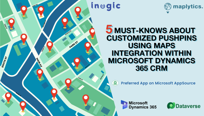
Team Maplytics has brainstormed on this basic human tendency and tried assimilating the same in developing the functionality of Maplytics, the preferred geo-mapping app of the Microsoft AppSource. One of the popular features of Maplytics enables the visualization of CRM Records on the Map. These records are visible in the form of pushpins. These pushpins can be customized in various colors. There are a few inbuilt pushpin designs that can be used to differentiate the different types of records. However, the property of Pushpins that is most in demand is their complete customization. This property allows the users to completely change the look and feel of the pushpins to coincide with the record type or as per their understanding and requirement.
For instance, the sales team of package juices can change the pushpins to the juice variety they sell, and the regions selling specific varieties can be visualized and highlighted.
Sounds interesting, right? Let us have a closer look at how these custom pushpins benefit
1. Easy Context Interpretation
During monthly presentations to the Management, the Sales and Marketing Teams can use the Maplytics instance or the screenshots to give a visual context to the stakeholders. In these, instead of showing records with normal pushpins, displaying them with an entity or a symbol that stands for the records, the understanding would become easier.
A local NGO can plot its branches in a particular area and display those in a meeting with potential sponsors or donors as seen below. The foster homes under their supervision could be denoted by different pushpins. The data can be interpreted effectively at a glance.

2. Quick segregation
An organization may have multiple partners. Segregating their sources, or areas of functioning becomes difficult at times. Having differentiating pushpins with relevant images may make analysis quicker.
As seen below, the locations of the various social media partners/ influencers can be differentiated based on the media they function on using the social media logos as pushpins.

3. Differentiation among 2 similar entities
With distinct pushpins representing the category of the records in concern, segregating the records becomes easier. The distinction can be viewed at a glance.
A transport company has two different kinds of trucks available for two different types of goods. The Blue truck has a freezer facility whereas the Red truck can transport liquids effectively. As per the requirement at any particular time, the trucks can be summoned that are nearest to the required location by plotting their current location on the map.

4. Noteworthy Presentation
The presentations that contain minimum data and maximum graphical or pictorial depiction encourage verbal communication, discussion, and thorough understanding. Such presentations have a higher retention and recollection rate because of the symbolic things or images used as milestones. A presentation with screenshots of actual site maps with the information displayed in a pictorial form reduces the alpha-numeric data entries and keeps the slides crisp.
The penetration of self-checkout kiosks as against the traditional POS kiosks can be quickly viewed on the map by customizing the pushpins. Standard pushpins need an explanation of what they denote whereas customized ones are self-explanatory. If a screenshot comparison as this is included in a presentation, the gist could be precisely delivered concisely.


5. Personalization beyond available options
A blue-colored pushpin could denote multiple things such as Annual Revenue, Industry, Leads, Sales, etc. in a presentation/ report. What the pin denotes needs to be specified every time. However, with complete personalization, the symbolic pushpins themselves shall state what they stand for.
The spread of a woman’s emergency contact center could be easily distinguished from a common emergency contact center as below, without any indicative specifics needed.

Personalizing pushpins thus eases the entire business process and creates an optimized view of a plethora of data.
There is a lot to explore about the outstanding unique features of Maplytics and a good trial will help in realizing it! You can write to us at crm@inogic.com for your mapping queries, a free trial of 15 days, or a personalized demo within Microsoft Dynamics 365 CRM / Dataverse.
To learn more about Maplytics, its applications across industries, and another multitude of features, do visit our Website or the Microsoft AppSource. For further details, you can hop on to our Blogs, Client Testimonials, and Video Library.
Until then,
Happy Mapping


