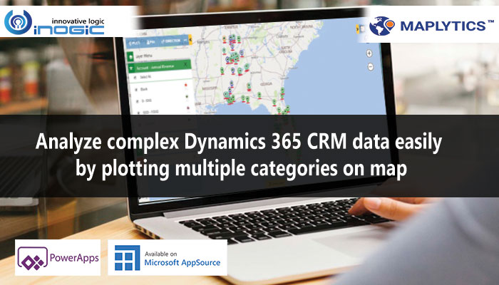
With every new release there’s something more exciting each time in your favorite Maps Integration App for Dynamics 365 CRM and PowerApps. In our recent April 20 release we saw some great features like Truck Routing, PCF Controls, Multiple Categories and Search POI locations with keyword.
In this post we will be exploring the new feature to plot up to three categories for a single entity. With this, users can also view multiple categories for an entity and combine them for a single outcome. For instance, if the categories plotted are Annual Revenue, Industry and Owner for Account entity then while plotting the result the outcome will be a combination of these three categories. Let’s understand this further in depth with the pushpins represented by the categories.

Now, as you can see above every category range has a different pushpin representing them. Let’s say Sam is a Sales Manager and he wants to plot three categories together. For this what he will do is in the category dropdown for Account entity he will select Annual Revenue, Industry and Owner and will plot the data and the category cards will open for different categories as shown above.
Here, Sam will be able to see the data plotted as a combination of these three categories.

In a case say, Sam deselects Annual Revenue category and wants to visualize the combination of the three categories. Now, since the final pushpin is plotted as a combination of all the three categories using AND which means there should be value fetched for all three categories, one category fetches nil result therefore the final pushpin becomes null or that there are no final pushpins plotted.

Thus, you have seen how with the help of Maplytics you can see the final result as a combination of all three categories. For now Maplytics allows plotting up to three categories for a single entity. Let’s understand how this improves your business results:
- View Combination of Data: Since the data plotted on map with multiple categories is an outcome of the combination of category ranges it enables seeing where all three categories co-exist. E.g. Blank Annual Revenue, Banking Industry with Owner Sam, all three in one pushpin.
- Better Visualization: This enables viewing data quickly without having to spend time visualizing where all the data exists one by one since the categories are plotted together. This saves a lot of time in a nutshell.
- Improved Insight into Entity Visualization: With the juxtaposition of all three categories of a single entity, it becomes possible to visualize the presence of that entity records on map in an enhanced manner.
With multiple categories a lot of weight is taken off by improving the complex visualization and making it seamless.
If you want a demo of how this feature performs, drop us a mail at crm@inogic.com
Also, download the solution for a FREE TRIAL of 15 days from our Website or Microsoft AppSource!
Happy Mapping and Stay Safe!


