Whether you are a startup or an already established business, measuring the key performance indicators (KPIs) allows you to gain an insight into what matters for the growth of your organization.
Microsoft Dynamics 365 being a flexible CRM system allows businesses to either use the out of the box fields for the CRM records or create a custom field for an OOB or a custom records. Organizations can then ensure that the KPIs that matters for them is correctly updated in CRM and later use the CRM records to analyze their KPIs.
However, this analysis lacks to take into account the locational aspect of the data. This is where business intelligence tools like Maplytics comes into the picture.
Maplytics not just empowers organizations to tap into the location aspect of business data but also allows them to visualize the CRM data on the map and further drill down into the data to analyze based on different KPIs.
Maplytics Dashboards in Dynamics CRM for an overview and quick analysis of KPIs
Dashboards in Dynamics CRM are a great way to have the data that matters the most organized in one place for a user to analyze the KPIs that matter for their organization at a glance.
Maplytics supercharges the Dynamics CRM dashboards with the ability to create map visualizations dashboards for different scenarios.
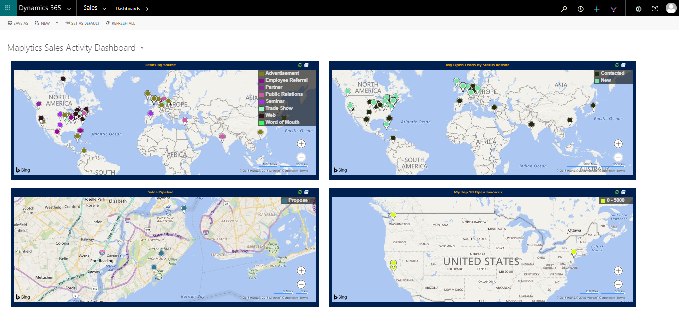 Caption: A sample Maplytics Sales Activity Dashboard
Moreover, the Maplytics dashboards can also be created for Heat Map visualization of Dynamics CRM data.
 Caption: A sample Maplytics Sales by Postal Code Heat Map Dashboard
To learn more about Maplytics Dashboards, refer to this links;
- Configure your own Dashboards in Maplytics for Microsoft Dynamics CRM
- Watch how Maplytics Dashboards help you get better insights of Dynamics 365 data
- Maplytics Dashboards – Customer Insights at a Glance in Dynamics 365 CRM!
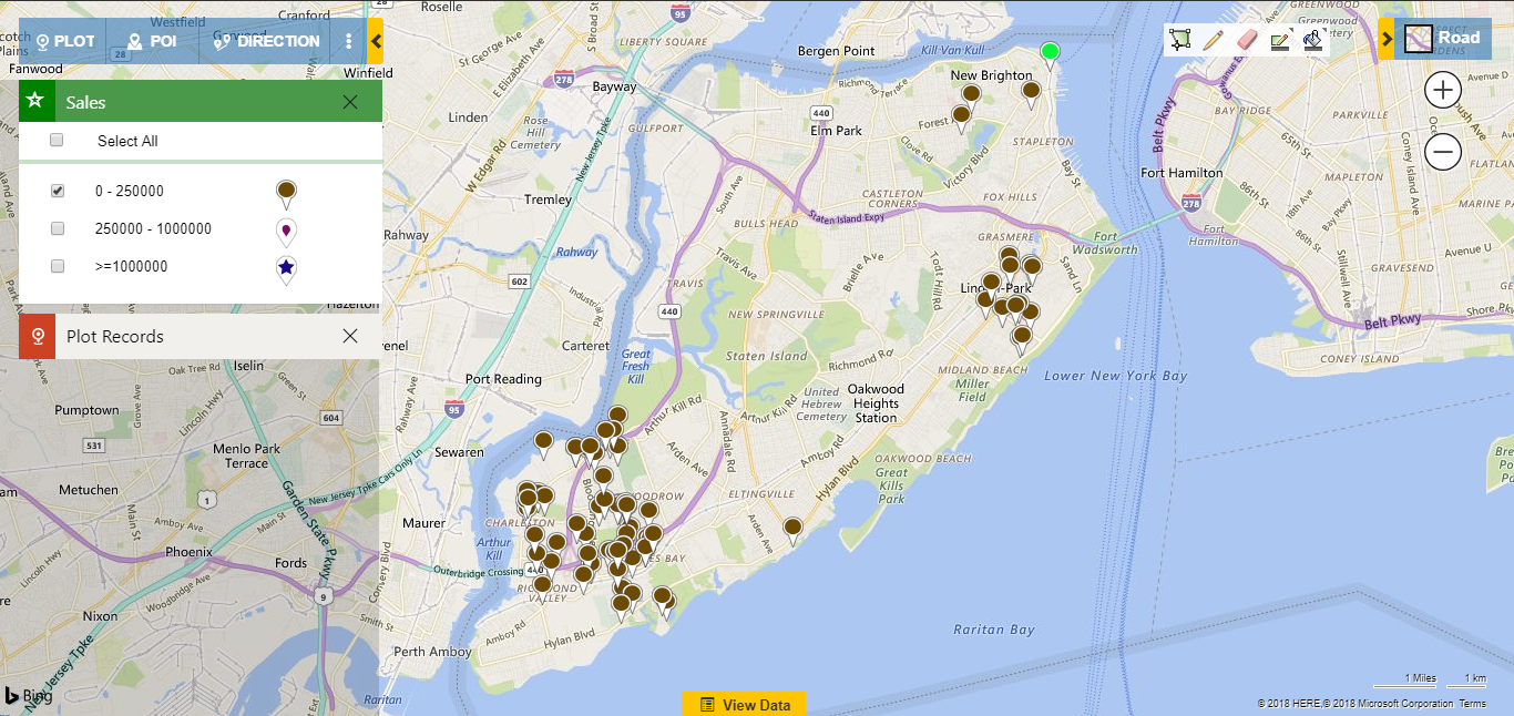
Category Filter and Summary Card for KPI analysis on a map within Dynamics CRM
The users can use the Detail Map in Maplytics to plot any OOB or Custom Dynamics CRM Entity, which is associated with address attributes, on the map. To plot any OOB or Custom Dynamics CRM entity that is not configured by default in Maplytics, the user needs to create a Maplytics Entity Map.
The users can also configure the pushpin color and shape for a particular Category (the field attributes of an entity) in the Category Configuration section in Maplytics Entity Map for that specific entity and use it as a filter on the map.
For example, an organization can choose to filter their Accounts based on Sales (their KPI) to analyze further and take actions on the filtered data.
 Moreover, the users can also get aggregated information of any enclosed shape on the map like a region, proximity zone, sales territories or a drawing. Clicking on any enclosed shape on Maplytics map brings the Summary Card which aggregates the Sum or Average of any numeric or currency field.
The field attributes of a Dynamics CRM entity for which you need the aggregated information, sum or average, can be configured in the Summary Card settings in Entity Map of that particular entity.
Heat Maps for analyzing the density based on KPIs
Apart from the Dashboards and Detail Map, the users can also create Heat Map visualizations of Dynamics CRM entities and analyze the density of the records based on their desired KPI.
Heat Map visualizations are a powerful tool for business data analysis and give an insightful visual way of analyzing the Dynamics CRM data based on selected KPIs.
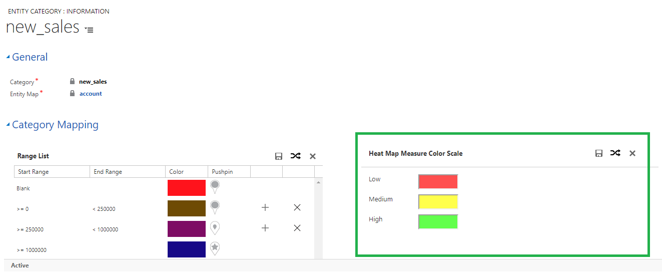
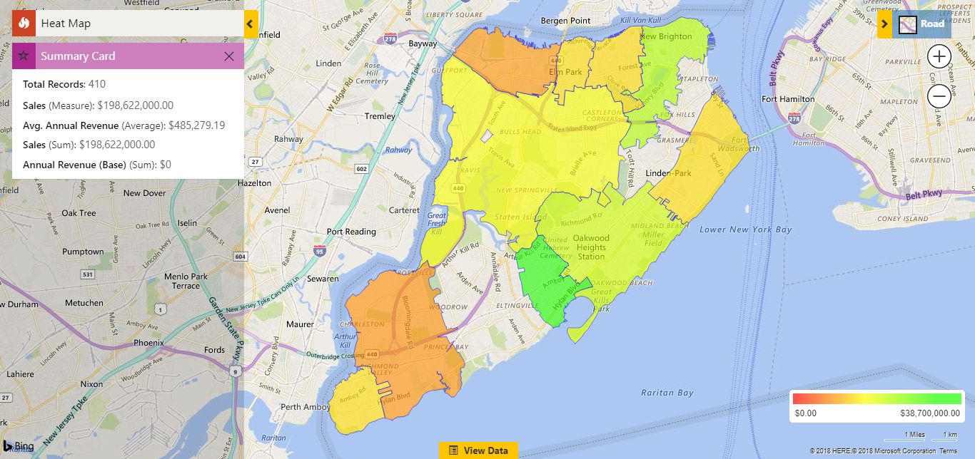 The users can use the Measure to choose any numeric or Currency field to create the Heat Map visualization based on. The Color Scale for different Measures can be configured in the Category Configuration section in the Maplytics Entity Map for that particular entity.
For example, in the above Heat Map visualization, we have selected the Measure as Sales and the Color scale is Red for lower values and Green for higher values makes sense for a KPI like Sales. However, for some other Measure or field attribute, you would like to have some different color scale, and Maplytics provides you the ability to do that.
 So, now with all these features in your Dynamics CRM, what KPI will you analyze? Let us know in the comments below.
Maplytics is a leading geo-analytical app for Dynamics 365 and is one of the first mapping solutions to be Certified for Microsoft Dynamics 365 (CfMD). Maplytics provides powerful map visualization and routing capabilities within Dynamics 365 to offer insightful location-based business insights. By using the powerful feature of Maplytics like Appointment Planner, Route Optimization, Proximity Search based on Distance and Time, Concentric Proximity Search based on Distance, Along the Route Search, Analytical Dashboards, and Territory Mapping & Management, an organization can drive better sales, improve business processes and engage right customers at the right time.
Get your free TRIAL today from our Website or Microsoft AppSource!
Happy Mapping!


