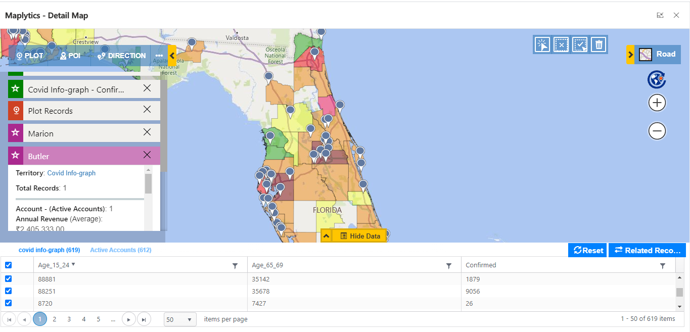
From the past 6 months, most organizations are facing many difficulties due to the COVID spread. In this blog, we will show you how you can configure and visualize the COVID effect on the Detail map with Maplytics. This will help you to answer important questions like which areas are the most COVID affected in your sales territory? What is the impact of COVID on your business? And where you can increase your business in the upcoming months to recover from this?
First, you need to get the updated shapefile for COVID to create a shapefile record in the CRM, this can be easily downloaded from the internet. To know more about how to create shapefile records, click here.
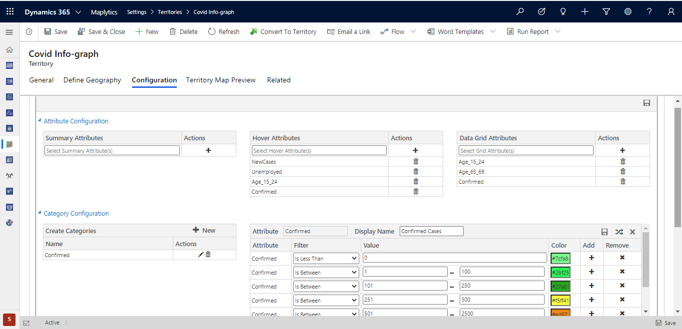
Once you create a shapefile record, you need to go to the ‘Configuration’ tab and create a category based on your requirement and then categorize the data in different ranges. In this blog, we have taken an example of ‘Confirmed Cases of COVID’ and categorized them in different ranges as shown below.
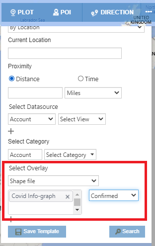
Once you complete the configuration part, users can open the Detail Map and select the shapefile and the required category in the Overlay section. We have selected the category ‘Confirmed Cases’ we just created in our example above. After clicking the search button, you can visualize the COVID areas on the map.
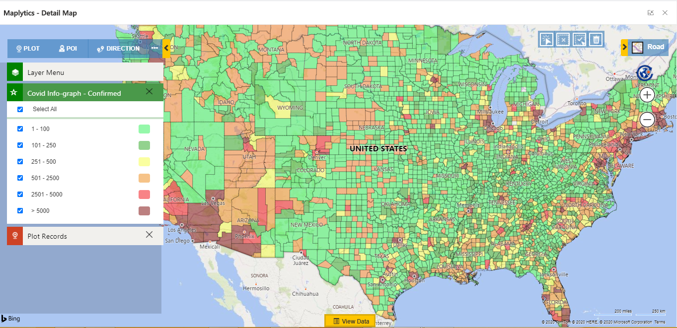
Let’s look at a scenario to better understand the utility of the COVID overlay. Suppose John is the head of sales in a medical insurance company. He wants to understand where he should target his sales efforts for selling his company’s policies in the USA under the current pandemic. So, John uses the COVID overlay to visualize a country-wide COVID impact analysis as shown below.
The COVID spread area is color-coded on the Detail Map according to its configured range. Here, users have both the options to visualize the overlay with or without CRM data.
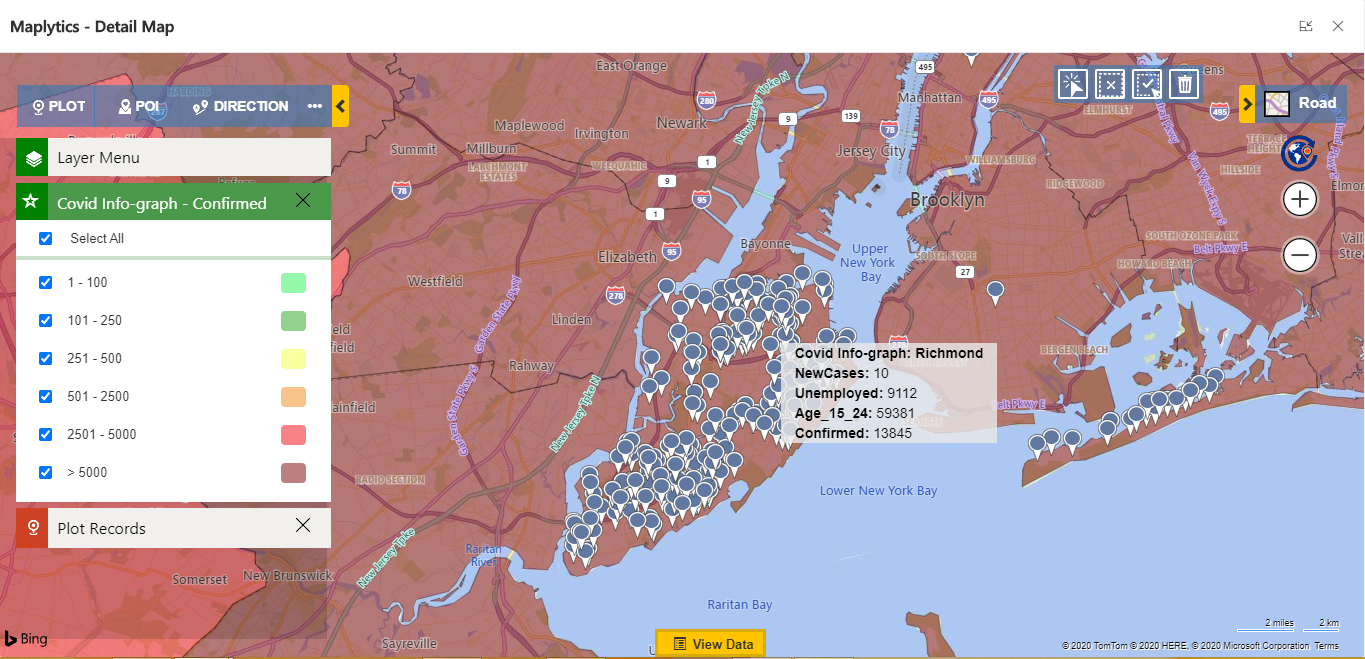
Next, John uses his report for the past 3 month’s overall sales in cities with high insurance sales to understand where business has declined. John finds out that in the past 3 months, Staten Island’s overall sales is only 45% as compared to last year. Using the visualization, John hovers on the Staten Island’s COVID overlay as shown below, and observes that there are more than 13 thousand COVID cases in Staten Island. Therefore, John concludes that Staten Island sales have declined due to the high COVID impact.
Now that John has discovered high COVID impact to be the cause for decline in sales in one of their well selling areas, he attempts to recover this loss by looking for an area with less COVID impact. Along with recovering the loss, it would also greatly benefit the people in this pandemic. So John decides to have a policy specially created for the age groups of youngsters and elders in low impact areas.
To find out the USA counties that best fit the target audiences for this policy, John uses the View Data’s Grid filter option and sets the following filter criteria:
1. Low COVID confirmed cases.
2. Age groups between 15-24 and 65-69 years of age.
3. All counties of the USA with overlay category of less than 5000.
After performing the filtered search, John can see a filtered visualization with the COVID overlay that shows him the analysis for all the counties of USA where he can choose the counties with the least COVID impact (below 5000) and the most population count between 15-24 and 65-69 years of age.
John finds that Florida counties have the least number of confirmed COVID cases with the most number of people in the age groups between 15-24 and 65-69 years. Therefore, John concludes that his sales efforts in the upcoming months should be targeted towards counties in Florida; this would help his company recover from the sales decline from Staten Island.
This is how Maplytics allows users to use the shapefile overlay to visualize the COVID impacted areas. Users can analyze various regions of their market to relate them to their current situation of sales and make better-informed business decisions to meet their targets.
With such detailed visualizations, the shapefile feature helps users to perform better in sales as well as other departments to meet their company vision.
For more info on how Maplytics is assisting organizations globally with their Location Intelligence requirements, download a free trial from our website or Microsoft AppSource.


