
Dashboards are everywhere. But most dashboards are nothing more than pretty boxes of charts.
Analytical dashboards are different. They answer questions that your data wasn’t directly asked.
With Maplytics, analytical dashboards bring CRM data, geo-mapping intelligence, spatial context, and configurability together to make decisions faster and smarter. Below, we explore how they really work.
What exactly are Maplytics’ analytical dashboards?
Maplytics analytical dashboards are map-enhanced views of CRM data embedded within Microsoft Dynamics 365. Instead of static tables or disconnected charts, these dashboards render CRM records onto maps, charts, heat maps, and visual tiles in a unified space.
 These dashboards aren’t limited to a single view. You can create multiple dashboards tailored to roles, scenarios, and workflows so that decision-makers see meaningful insights at a glance.
Why does analytics need a map? Is regular CRM reporting good?
Imagine you see a list of leads in a table. You have their names, values, and cities. But do you easily know-
- Where are most high-value leads clustered?
- Which territories are underserved?
- Are your field reps’ routes efficient?
A traditional chart can’t tell you that.
Maps add a spatial context to data, and once location is added, patterns emerge, such as clusters, gaps, correlations, territory imbalances, and regional performance differences. Looking at a heat map of opportunities instead of a spreadsheet instantly reveals areas of strength and weakness. This can be compiled with the adjacent tile of field service movement currently in that region, turning visuals into decisions.
Maplytics dashboards embed this geospatial intelligence directly into CRM dashboards, making location a first-class citizen in your analysis.
What can users see in a Maplytics analytical dashboard?
In a Maplytics analytical dashboard, you can plot and visualize-
- Accounts, leads, opportunities, and custom entities on the map
- Heat maps showing density or numerical gradients (like revenue or lead count)
- Summary Cards alongside maps for cross-analysis
- Routes and territory overlays, etc.
 Maplytics ships with pre-defined dashboards for common sales and service scenarios, but administrators and users can also build custom dashboards to reflect the exact metrics they care about.
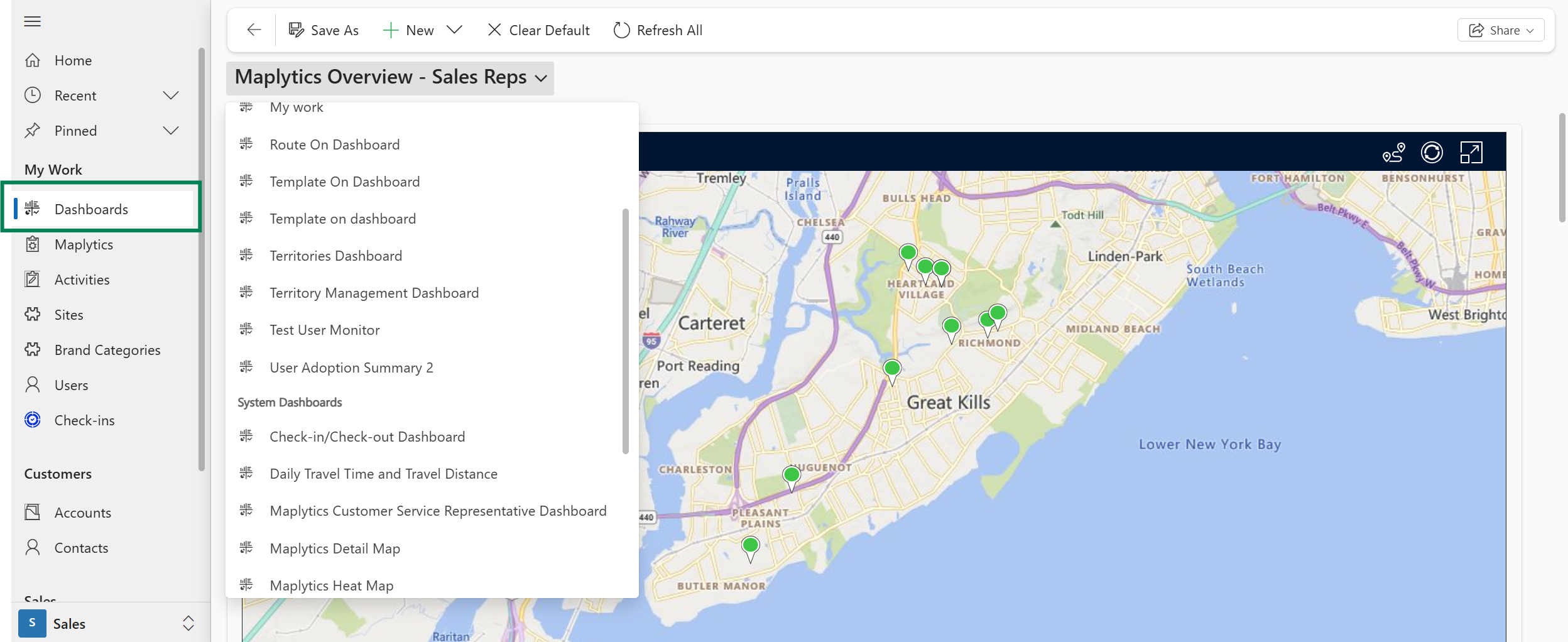
How do you configure an analytical dashboard in Maplytics?
Configuring a Maplytics dashboard is a combination of three key steps:
1. Define the Dashboard View
Inside Dynamics 365, users navigate to the dashboard details and create a new Maplytics dashboard view. Here, they give it a unique name and select the entity they want to visualize (e.g., leads, accounts). They can use FetchXML queries, generated from Advanced Find, to slice and filter the data precisely before it hits the map.
2. Add it as a Web Resource
To include the Maplytics view on a standard CRM dashboard, administrators add the Maplytics web resource (Maplytics.Dashboard.html) and specify it as a custom component. This embeds the interactive map directly into Dynamics dashboards.
3. Use Templates for Reusability
Instead of recreating the same filtered map repeatedly, users can save search results as templates and add them to dashboards. Once a template is saved, it can be reused, thereby eliminating redundant steps and saving time.
When configured, the dashboard instantly visualizes the selected CRM data with all the spatial and analytical power of Maplytics.
How do filters and queries work behind the scenes?
A dashboard is only as useful as the data it pulls. Maplytics dashboards are driven by FetchXML queries, the same powerful CRM query language used inside Dynamics 365.
- You can retrieve specific attributes
- You can apply filters and joins
- You can include latitude and longitude fields (needed for mapping)
Once a query runs, Maplytics takes the result set and plots it on the map automatically, letting users interpret dense CRM data visually instead of reading it row by row.
What types of visual elements can you include in a dashboard?
Maplytics dashboards go beyond static points on a map. You can include-
- Map plots– visual pushpins with color, shape, and category logic
- Heat maps– density or value intensity layers
- Charts– donuts, bars, and columns that respond to map filters
- Routes and territory overlays- for precise information
- Summary cards– quick snapshot metrics
This integration means that when a user interacts with one widget (like a region on a map), other components (charts or summary cards) can respond dynamically, giving a multi-dimensional picture of CRM data in a single screen.
Can non-technical users build or modify dashboards?
Absolutely. While dashboard views can be built using technical query tools like FetchXML, Maplytics dashboards are designed to be flexible.
- Users can save templates without writing code
- Administrators can drag and drop dashboard components
- Web resources make the dashboards part of standard CRM
This means that business users and managers can adjust their dashboards to reflect changing business needs without heavy reliance on IT or developers.
What problems do Maplytics analytical dashboards solve in the real world?
Sales Insight at a Glance
A sales leader might want a view that shows open opportunities, pipeline value by region, and proximity of leads to sales team locations, all on one screen. A dashboard lets them immediately spot under-serviced regions or areas with high value but low penetration.
Service Planning
For service dispatch teams, a dashboard that overlays service request volumes on a map with technician routes can highlight delays caused by geography, not performance, driving smarter resource allocation.
Territory Management
Organizations can quickly see where territories overlap, where performance is weak, and where workloads are unbalanced, all visually, enabling smarter planning and more equitable distribution of responsibilities.
These real-world scenarios show why dashboards are a visual as well as a decision tool.
How does Maplytics ensure dashboards remain performant and secure?
Dashboards in Maplytics inherit the underlying security model of Dynamics 365.
- Data exposure respects CRM roles and permissions
- Real-time visualization ensures dashboards reflect up-to-date data without replication
- Web resources run inside Dynamics, avoiding external systems
This means user security is preserved, and performance is kept efficient because Maplytics leverages CRM’s query engine and map rendering technologies rather than duplicating data.
What’s the role of templates in analytical dashboards?
Templates are a powerful time-saver.
Rather than filtering and configuring a view every time you open a dashboard, you can save search criteria once and pin it to the dashboard. For example, a “VIP Accounts Near Me” template can be reused daily without manual setup, ensuring consistency and saving time for busy reps.
How do Maplytics dashboards support ongoing decision-making?
Dashboards are living windows into business performance. They enable teams to-
- Visualize trends and changes in real time
- Compare regions, categories, and time periods
- Include spatial patterns like density and proximity
- Act directly from insights by linking to tools like routing, scheduling, and workflows
This holistic approach, combining CRM accuracy with spatial analytics, turns dashboards into strategic instruments rather than passive reports.
Maplytics analytical dashboards take Dynamics 365 CRM data out of spreadsheets and give it life by adding context, location, and interactivity. They are a lens through which every CRM metric becomes meaningful.
What’s more?
Do you wish to combine maps, charts, templates, and real-time queries for improved decision-making? Maplytics with MapCopilot, its AI assistant, is available immediately for Dynamics 365, Power Apps, Power Pages, and Dataverse. Organizations interested in adoption, 15-day free trials, or personalized demos are encouraged to contact Maplytics’ sales team at crm@inogic.com
For more information, visit our website or Microsoft Marketplace. One can hop onto the detailed Blogs, Client Testimonials, Success Stories, Industry Applications, and Video Library for a quick query resolution. Technical docs for the working of Maplytics are also available for reference.
Kindly leave us a review or write about your experience on the Microsoft Marketplace or the G2 Website.
Sam Kumar
https://www.maplytics.com/Sam Kumar is the Vice President of Marketing at Inogic, a Microsoft Gold ISV Partner renowned for its innovative apps for Dynamics 365 CRM and Power Apps. With a rich history in Dynamics 365 and Power Platform development, Sam leads a team of certified CRM developers dedicated to pioneering cutting-edge technologies with Copilot and Azure AI the latest additions. Passionate about transforming the CRM industry, Sam’s insights and leadership drive Inogic’s mission to change the “Dynamics” of CRM.


