“Data will talk to you, if you are willing to listen to it.” This quote signifies the importance of deriving actionable insights from business data for decision-making. Analyzing the business data will provide a clearer understanding of the weak spots that are holding back a business organization. In addition, identifying the Achilles heel of your business will allow you to work on them and strategically make action plans for its growth. But, the task of analyzing large datasets can be an intimidating task. This is where “Heat Maps” heaves into view.
Heat maps allow visualizing data graphically as a color scale gradient on the map showing the heat of the data. This visual hierarchy enables users to analyze the relative performance which further helps to recognize trends hidden in the data. Maplytics (Preferred App on Microsoft AppSource) allows users to view heat maps in different ways. It provides four options to display data on a heat map. Here is how different options of visualizing data on heat maps within Maplytics can be used for business growth:
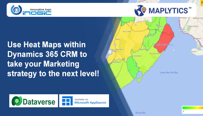
Tracking the Leads generated in different regions using ‘boundary’ option
In order to grow the customer base, companies need to generate leads constantly. Heat maps in Dynamics 365 allow to visualize the number of leads spread in geographical regions through a color-coded scale. The scale represents the density of leads over a particular spread and can be used for reporting by the marketing team. This way, the marketing team will be able to make campaigns focused on the regions with low lead generation. In the image below, the leads present in different postal codes of a business organization are shown.

Expand the business using ‘no boundary’ option
Users can use ‘No Boundary’ option in Heat Map to get customer densities on the basis of annual revenue without geographical boundaries. This gives the user a detailed analysis of the geographical areas with less or no revenue. Depending on these insights, one can make plans to find the potential customers, increase the company’s outreach and thereby expand the business. Therefore, heat maps can be a great tool for a company to expand its coverage in market regions with less revenue.

Make strategies by visualizing data in a pie chart
It is important to classify leads based on their importance and how interested they are in your product. This will also save precious time of the sales team while dealing with potential customers. Pie chart option in heat maps allows users to visualize leads by rating (cold, hot or warm). This comparative data can be used to make strategies to follow-up with those leads while keeping-in-mind the resources and time available in hand. Also, with Maplytics, businesses can use the summary card to visualize the entire data plotted at a glance.

Get Industry-wise data with column chart
Heat maps make data analysis very user-friendly with column charts. The maps can be used to analyze the graphic data of the density of customers in different industries. Marketing team can use these insights to customize their promotion campaigns for the industries with low customer counts. Further, the top management of the organization can reach-out to those industries and check how their products can fulfill their specific needs.

As you can see, heat maps are a great way to visualize the summary of business data on a map. It can be a great tool for business organizations to identify the pain-points of their business and thereafter grasp the nettle to achieve business goals.
There is much more in Maplytics than heat maps. Explore more about our other features like territory management, route optimization, etc. by visiting our video library. Download Maplytics for a free trial of 15 days from our website or Microsoft AppSource and test Maplytics for your mapping requirements. Contact crm@inogic.com for a free demo.


