We are in the first quarter of year 2019 and still reminiscing what an awesome year 2018 has been! With two major releases last year that were epitome of success, we introduced bulk of features to simplify the lives of our end users. In March 2018 Release our focus was to boost field productivity and October 2018 Release empowered the managers to take strategic decisions within Dynamics 365 CRM.
As our team of dedicated professionals enjoys every bit of the journey, it immediately sparks for a new venture the soonest we announce a release. Similarly, here we are, all grateful to the technical architects of our team, our peers, Partners and customers, to announce another, on schedule, Major Release. Yes, we are back with a set of exciting features for you! This release is even more powerful and loaded with features than our last releases. It focuses on boosting the analytical and visualization powers of its users amongst other capabilities.
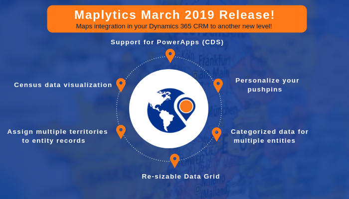
Let’s delve deep and understand the features of March 2019 Release:
Support for CDS
PowerApps empower Citizen Developers and Power Users to design low code applications with control over great UX. It allows developing scalable agile applications without compromising with quality, security and usability. Now, Maplytics can be deployed on PowerApps for users who want to use Maplytics outside of Dynamics 365 CRM.
Census Data Visualization
To enhance the analytical capability of an organization through Maplytics, we have introduced Census Data for better visualization on map within Dynamics 365 CRM. By default we have added the Census Data for US with Category Configuration available for it. You can add your own census data, create further categories and plot them on the map. The census data can be plotted with the existing Overlay feature.
Resizable Data Grid
Now Maplytics users also have the option to resize the data grid. They can drag and expand the data grid to view it on the map as per requirement. The users can view their desired pushpins with desired ratio of data grid with the using resize option as required. They also have the option to filter data with view data grid and picture the filtered data on map.
Multiple Category
Users can now plot multiple categories for multiple entities. Earlier we could plot only one entity with a category. Now, for the three entities you can plot one category for each individual entity. This expands the visualization power of the Maplytics users.
Multiple Territories
Up till our last release one territory could be assigned to only one record. But, in many of the cases it is needed to assign multiple territories to a single record and to facilitate this, we came up with a solution. Now, multiple territories can be assigned to a single record using Maplytics. Users can see the list of territories assigned to a particular record within the respective record page as well as visualize the same on map.
Personalize your Pushpins
It is always user friendly to be able to use your personalized icons for a pushpin. This allows the user to be able to plot in a user friendly manner and make better and easier analysis of their data on Dynamics 365 CRM map. We have added a section to upload your own pushpins or icons in default Maplytics configuration in order to visualize entities with desired pushpins.
These are the major features we have added in our current release, apart from which there are many minor features which will make it even more functional. This release provides detailed insight to the visualization capability of the data plotted on map and empowers the users to make informed decisions.
So, what are you waiting for, download our latest solution from the Website!
Hope you have a great experience with the current release. We are awaiting your feedback! In case you have any suggestions, queries, want a demo or need assistance with installing Maplytics on PowerApps drop a mail at crm@inogic.com
Till then –
Happy Mapping, Ciao!


