Big organizations are run on large scale globally. For these organizations to run successfully, there needs to be a practical approach and track of operations on the organizational level. Statistics can help in keeping track of records but there needs to be a more pragmatic approach that presents the holistic picture of the performance of the organization. Here the pictorial representation comes into picture.
By visualizing the statistics in form of charts or graphs, the relative analysis can be made easier and performance can be tracked regarding other regions. With Maplytics this visualization of Dynamics 365 data can be done seamlessly on map. By viewing the leads, prospects and clients on map, it becomes tad easy for the organization to make decisions and also visualize the performance of their development centres in different location or regions.
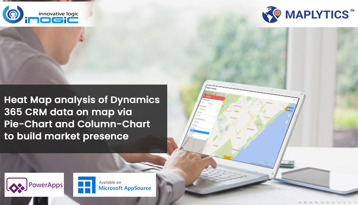
One of the most popular methods to visualize the data on map is by Heat Maps. It originates from far in time and has earned itself the badge of being most relied upon tools for thematic analysis. Maplytics uses Heat Maps to visualize data spread based on different measures. This measure can be of annual revenue, credit limit or other such numeric fields which is tracked based on the filter. The filter can be industry, account name, etc.
Maplytics plots the Heat Maps based on four filtered categories:

- Boundary: Here the data is plotted on distinct boundaries i.e. there is precise fencing around the geographic locations.
- No boundary: The data is shown as patches of heat based on the heat of the data selected.
- Pie-Chart: With Pie-Chart the proportional data is shown in the form of Pie-chart and easy analysis can be done using the filters.
- Column-Chart: Here the data is spread into Column-Chart and the statistical and visual analysis is done.
Let’s understand how pie-chart and column-chart analysis is made in Heat Maps.
Pie Chart
As we know while doing pie-chart analysis, we examine the data spread within 360 degrees. The relative analysis is made keeping in focus how much data the filter contributes to out of 360 degrees. For instance, say we are doing analysis based on industry, then pie-chart analysis will analyze what portion of the pie-chart is occupied by different industries viz. Accounting, Banking, Consulting, Engineering, etc. in different regions. We can do this analysis for different geographical regions like state, postal code, county, country, etc. for measuring the kind of area we want to analyze.

Column Chart
Column charts are represented by a group of rectangles. Here the value of each rectangle bars is determined by the height it has. The greater the height of rectangle, the greater its value. The bars of rectangles are generally drawn vertically and are called column charts. Unlike pie-chart, there is no fixed value out of which the proportion is allocated but instead a relative length of column which determines which column has greater value. It is also driven by filters that determine the value of measures for different filters.

Thus you have seen how with the help of pie-charts and column-charts in Heat Map you can standardize the analysis based on concrete figures. This is far more preferred mode of analysis when you are looking out for exact data values. With Heat Map analysis you can also take strategic decisions for your organizations and launch campaigns from time to time to optimize the performance of your business.
In case you feel you could also benefit from Heat Maps drop us a mail at crm@inogic.com.
To explore the app for a free trial of 15 days download it from the website or Microsoft AppSource.
Till then, Happy Mapping!


