In the VUCA world, the shortage of time is forcing professionals to work smartly and cleverly. The daily operations and processes are being altered to cut slack and accommodate a work-life balance without compromising on the quality of work. Team Maplytics wholeheartedly supports this policy and designs updates to its unique features to make operations easy, and generate assorted outputs, without spending a lot of time.
Maplytics, the preferred, 5-star rated app of the Microsoft AppSource is aimed at making the process of geo-mapping and geo-analytics seamless and smooth for its users belonging to various levels of seniority and experience. One of the features aiming at this lets the users define their Dashboard views for Maplytics and include them as web resources in standard Dynamics CRM Dashboards. Maplytics ships with five pre-defined Dashboards for various Sales and Service Modules for different user roles.
Wanna know this in-depth? Do write to us at crm@inogic.com for a personalized 1:1 demo as per your business requirement. |
Then what is the new upgrade for the Dashboards in this with the October 2022 release? Let us see-
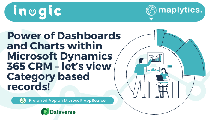
View Category donuts in the dashboard
Users can view the categorized data in the form of donuts or donut charts on the respective dashboards.

In the screenshot above, in the first dashboard view, the appointments for the team are plotted which have been categorized based on the status of the appointments. The donuts are shown based on the percentage of the records falling into each of the categories. For example, 17.50% of the total appointments were canceled, 47.50 % of the total appointments are completed and 35 % of the total appointments are scheduled. If the user hovers over the donut, they can see the exact count of records falling into each of the categories.
Similarly, the second dashboard shows the heat map for the Accounts based on the annual revenue. The donuts show that 18.10% of the total Accounts have Annual revenue ranging from 0 to 5000 and 19.73 % of the total Accounts have Annual revenue ranging from 5000 to 10000.
The feature is available for both Detail Map and Heat Map and allows a choice of ‘measure’. By default, ‘count’ is the measure for display which could be changed to any of the category options.

When changed to a Heat Map view, keeping the Measure the same as revenue, the value of donuts remains the same but the map display changes as per Heat Map.

What are the benefits of this feature upgrade?
- Summarized data for quick viewing
- Easy to use precise numbers for targeted presentations and comparisons
- Fine Digital/ Pictorial representation of complex data
With the usefulness of the feature established and appreciated by the Users, Team Maplytics is working on further enhancing it with more intricate details and advanced correlated functionality with the next release.
You can write to us at crm@inogic.com for your mapping queries, a free trial of 15 days, or a personalized demo within Microsoft Dynamics 365 CRM / Dataverse.
To learn more about Maplytics, its applications across industries, and another multitude of features, do visit our Website or the Microsoft AppSource. For further details, you can hop on to our Blogs, Client Testimonials, and Video Library.
Until then,
Happy Mapping


