Leading a successful organisation needs leaders with informed decisions. In a world of ever-changing technology, it is always suggested to have a thorough analysis in order to take informed decisions. One of the very demanding analysis tools is the Heatmap. It represents the data as a color scale gradient on the map showing the heat of the data. In the last few years, the heat map has increasingly been taken seriously in terms of analysis for defining organizational strategies.
Heat maps is amazingly popular with various disciplines where large volumes of data has to be made comprehensible. Becoming all-pervasive in everyday life, heat maps helps to manage Dynamics 365 CRM data more wisely. As we know that almost every organization is now using Dynamics 365 CRM, Maplytics (featured app on Microsoft AppSource) has added a good contribution by linking Dynamics CRM data and heat maps. With the use of Maplytics, one can now analyze Dynamics 365 CRM data on the basis of the heat of the data using the Heatmaps.
Visualization of Heat Map
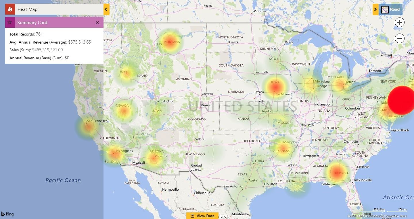
Let’s see how a heat map looks like in Maplytics. The below screenshot shows the heat map visualization of Account records in Dynamics CRM of Staten Island.
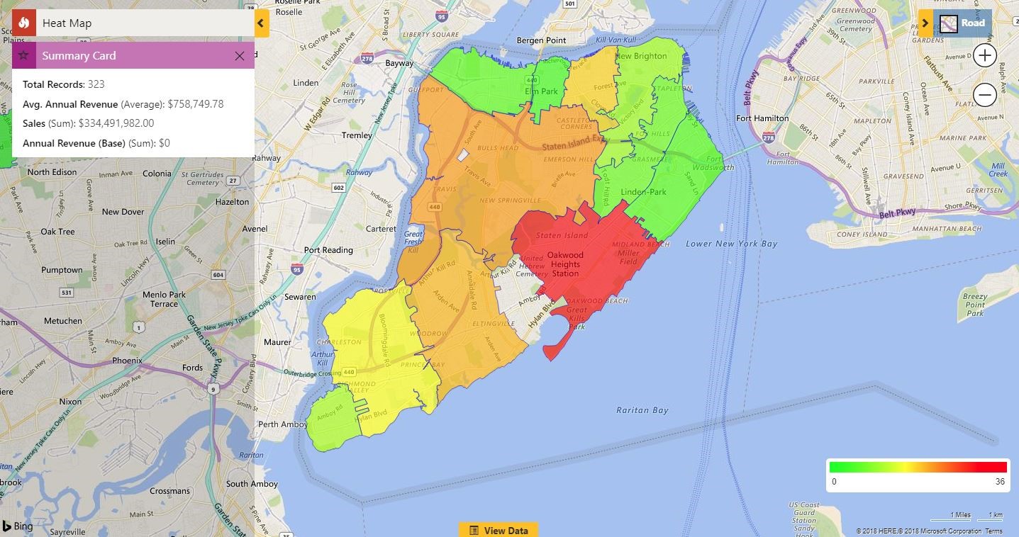
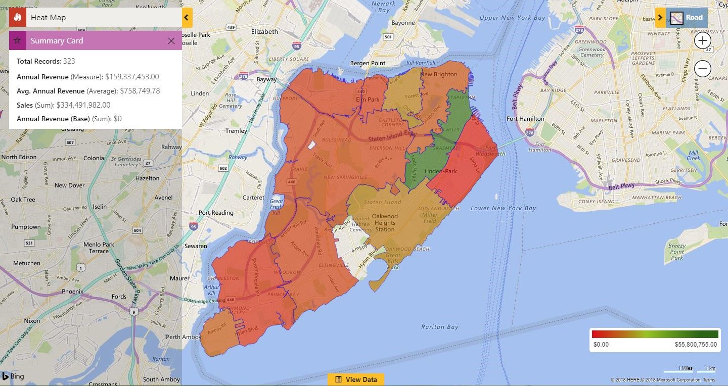
The standard colors of any heat maps are Red, Yellow and Green as shown in the above screenshot. What if the user needs a range of colors other than these to visualize the graphical representation of CRM data? Maplytics has provided an option to fulfill this requirement. Now the user has an option to change the color scheme for heat map, so as to provide freedom to the users to select different colors for different ranges of data according to the preference. Read this article to know how to change the color scale to view the data in different colors as shown in the screenshot below:
Benefits of Heat map:
1. Maplytics heat maps make it really easy to have a quick overview of the whole data, identify trends and compare required influential factors in a glance on the basis of the color intensity.
2. The color gradient gives a continuous range instead of breaking the data into discrete ranges. This visual hierarchy enables the users to analyze the relative performance which further helps to recognize trends hidden in your data.
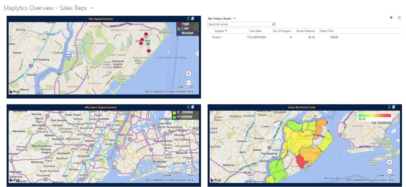
3. With the help of Maplytics, the user can add views of heat maps to a CRM dashboard. This helps the user to compare heat maps with various views of data plotted on detail maps and other graphical or listed data added to the dashboard.
4. Heat maps make it more of a visual experience than that of the standard analytics report. There are no numbers and no complex shapes. Instead of reviewing time-consuming large amount of analytical data, heat map makes it much easier to analyze through column chart and pie chart.
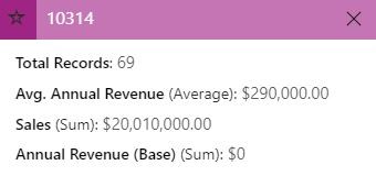
5. With Maplytics user gets a default summary card as well, which sums up the whole data plotted in the form of Average or sum value for the data plotted
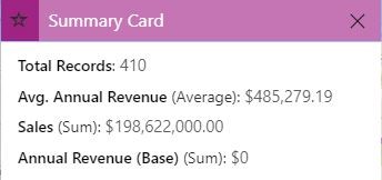
6. The user can further get details of any specific region in individual summary cards by just clicking on the region.
7. The user can add a category to filter the data and also set colours for the particular category as shown in the blog mentioned above. This way it’s easy to analyze the data on the basis of a particular attribute which further facilitates to see the effect of a required factor. This way a user can easily analyze various aspects like sales, market saturation, opportunities, revenues etc.
8. Instead of spending time on all the data with the option of ‘no boundary’ the user can easily filter out the areas where more attention is needed. For ex. The user can filter the untapped markets, or low sales areas or find most profitable regions.
 9. Heat maps can also be used to track if the strategies are falling into places. As the time goes by one can track if the trend has changed in favor and further check if which factors are causing if any failures in specific regions.
10. Last but not the least heat maps not only helps the user analyze the business data and create effective strategies but also it’s visually appealing which makes analysis, even more, easier and interesting.
Now that you have 10 reasons as to why to use heat maps. Start a free trial on Maplytics to try heat maps today. Click here to download Maplytics solution as per your Dynamics CRM version and let us know your feedback how it has helped you plan your business in a better way. It’s not just about Heat Maps don’t miss Top 8 Reasons Why You Should Have Maplytics as a Part of Your CRM Strategy.


