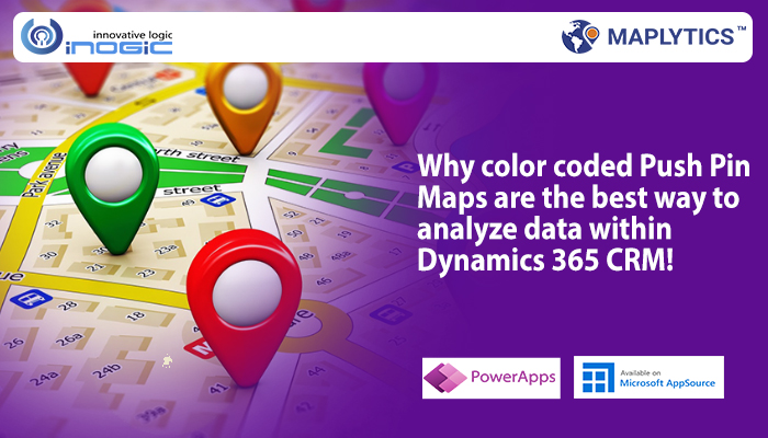
CRM data visualization on map allows users to conduct a thorough analysis of their data and take informed decisions. The visualization experience of CRM users can be personalized based on the preference of the users. Maplytics, a local intelligence tool that integrates Maps with Dynamics 365 CRM data, provides a large number of personalization options for the convenience of users. Some of them include- personalize the pushpin shape and color, default location, map centre and zoom level, map mode, optimize direction by default, and many more.
In this blog, we will discuss how users can select and save pushpin and color from map to improve their experience of data visualization within Dynamics 365 CRM. Maplytics users can select the required pushpins and respective colors on the ‘Plot Records’ card itself while visualizing their CRM data on map. Moreover, the selection of the pushpins and colors will be shown on map in real-time and hence the visualization experience of the records on map will be improved. In addition, the users can now select and save the required pushpins and respective colors for the categories plotted on the map within the ‘category’ card while viewing their categorized records on the map. Let us see a use case to understand this feature.
Adam Smith is the sales manager of his company Omega Hardware. He wants to know about the current situation of sales of his company in the territories managed by him. For this purpose, he will go to ‘Maplytics App’, open the ‘Detail Map’ and then plot his territories. As in the image below, he uses the option of ‘By Territory’ in Plot Card and then in ‘Select Territory’ option he selects those territories that are to be plotted. Thereafter, the client records assigned with those territories appear on the screen.

Here, if Adam wants to visualise the pushpins in any specific color or icons; then he can change it from the plot record card itself. Once Adam changes the color and pushpin, it will get instantly visible on map. This way he is able to visualise the records within the territories with the required pushpin and the shape.

Now he wants to categorise the records based on industry to view the performance of his products in different industries. He chooses ‘industry’ as the category attribute and plots the accounts to see which industry gave the most of the sales. Now, Adam is able to see the pushpins in different colours for different industries.

Now, after plotting the accounts categorized by industry, if Adam wants to change the pushpin icon and color for any particular industry to bring more clarity in visualization, then he can go to ‘Category Card’ to make the changes. As shown in the image below, the color and pushpin of all the industries are changed.

Now, Adam can click on a territory to view its summary card and thereby get the summarized information of the annual revenue generated from the individual industries. As shown in the screenshot below, Adam opens the summary card for the territory 10302. He can select any numerical attribute within the respective entity map to be shown in the summary card as sum or average of the values in the records.

From the Summary Card, Adam learns that the Entertainment Retail Industry and the Legal Services Industry are generating good revenue for his company; while the Consulting Industry gives the least revenue. Thereafter, Adam should focus on making sales strategies to generate leads and increase the number of clients in Consulting Industry. Moreover, Adam infers that the Entertainment Retail Industry and the Legal Services Industry should be the centre of attraction of all his business plans so as to maximize the profits of his company.
Therefore, it can be concluded that Summary Card can be of great help to evaluate CRM data on map and how it can help to increase sales of a company.
Follow our Maplytics blog to know about the other personalization options available in the app. Download Maplytics for a free trial of 15 days from our website or Microsoft Appsource. Start a free trial today and test Maplytics for your mapping requirements. Contact crm@inogic.com for a free demo.


