Dynamics 365 CRM data has been very useful for every organization in terms of analyzing their data, understanding the current situation in sales, services and various departments of the organization. Maplytics helps managers to have a detailed analysis of Dynamics 365 data. Based on this analysis managers can make strategies to reach the goals of the company and hence meeting the vision decided.
After the completion of analysis and decision on the strategies, the field professionals come to action and follow the strategies decided. Your favourite app Maplytics again comes into focus to help the field professionals to plot their data, plot routes and much more. While plotting so much data on the map, Maplytics also takes care that the data is clear enough to visualize and drill down into the data and take necessary operations.
Let’s understand how to increase the efficiency of the map by plotting multiple data on the map and still visualize each data individually to get a clear view of the data. Harry is one of the best salespeople his company has. He is responsible for meeting the leads and prospects to help them with their requirements and hence convert them into customers. To meet all the clients, he uses Auto scheduling to create an automated schedule, which he follows on a daily basis.
In some cases, if any meeting gets can cancelled or any meeting is over before time and he has some spare time to spend, he can easily use Maplytics to search for clients around his current location so that to see which clients he can meet in the spare time and then can continue with his rest of the scheduled plan.
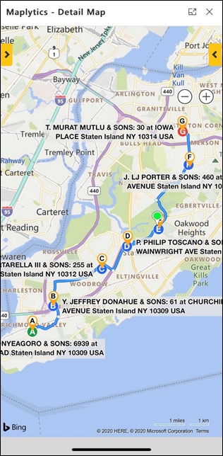
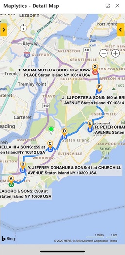
To do this, he opens the Detail map on the Mobile and plots the route created by Auto scheduling which he is following today. As client at the waypoint E was not available for the meeting, now he is standing near the waypoint E and will perform a proximity search to visualize all the clients, which exists, around his location. To perform a proximity search he clicks on locate me button to plot his current GPS location as the current location on the map. Now he enters a few values for the radii within which he wants to search for the records around his location.
Now he clicks on search and plots the proximity search. This shows him all the clients on the map which exist in the radii entered. Now he can see both the data around him as well as the route he is following today.
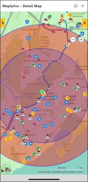
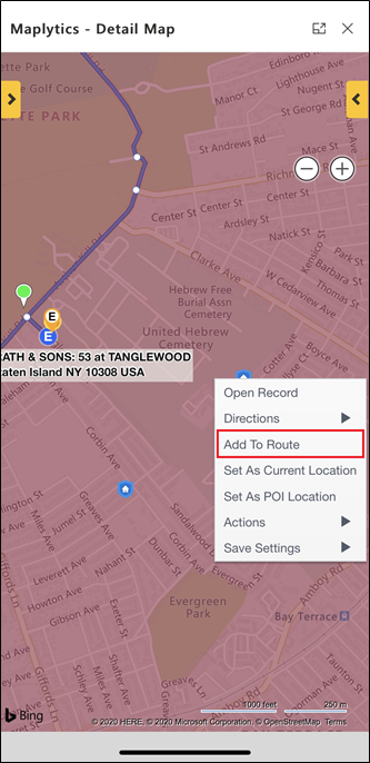
He needs to know which clients are the nearest to his current location whom he can meet and continue with his rest of the route later. Now he can see that three clients are there which are the nearest to his current location. He looks at the straight-line distance for each of the three pushpins on the tooltip card by simply clicking on the pushpins. He also uses the show travel distance option from the direction card to check the shortest travel distance from the current location to each of the pushpins. Now with the help of this search he can also see the Shortest travel distance for each of the pushpins. Now he calls nearest clients by clicking on the phone number on the tooltip card to see if the client is available for a meeting. He found that the client R Peter Chiang & sons is available for a meeting.
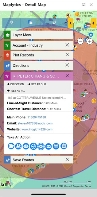
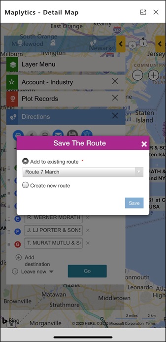
He easily adds this client to the route, removed the existing client at E ![]() waypoint and updates the route by using the Save button on the direction card to save the changes to the route.
waypoint and updates the route by using the Save button on the direction card to save the changes to the route.
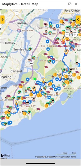
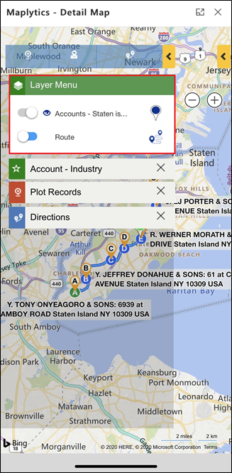
After adding this client to the route he uses the layer menu to hide the proximity search to make the map clear enough to view the data. This helps him to show the data again whenever needed in such cases.
Now easily uses the open navigation links button to navigate himself through the turn-by-turn directions on Waze App and goes to meet the new client he has added to the route and further uses the Check-in feature to Check-in and Check-out for the meetings. After completing the meeting with Peter, he can continue with the rest of the meeting added in the route.
This way using the layer menu he can easily toggle between the data he wants to see and perform mapping actions on the data plotted. It helps Harry to visualize every data clearly even after plotting multiple data on the map.
Start using Maplytics for your day-to-day field activities and let us know your feedback at crm@inogic.com. We would love to have your feedback and also valuable suggestions for our features in Maplytics.


