
Yes, you heard it right, we are back with another Major Release – March 2019!
There are some really strong features introduced like Census Data Visualization Support for CDS(PowerApps), Multiple Territory, Resizable View Data Grid and other highly significant ones.
One of the features which was requested by many users was to add icons of own choice as Pushpins. Wouldn’t it be great if the marketing team could show the number of Twitter or say LinkedIn users around their location or in a specific location? To ease and optimize their visualization strategy we introduced a new feature and called it bring your own icons for pushpins.
It seems like a simple feature at first glance but the business insights it provides is groundbreaking. For large datasets, this gives an optimum solution by providing a quick overview. For instance say you plot two Entities Accounts and Contacts. In case you have not personalized your pushpins, default pushpins will be plotted on the map. But with this release, Maplytics gives you the liberty to use your own icons for pushpins.
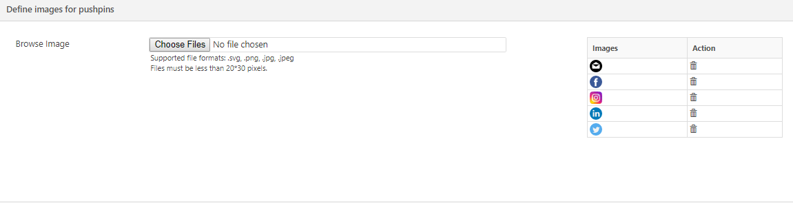
For bringing your icons for pushpins you need to go to Settings > Maplytics Configuration Details > Open Default Configuration Record > Advance Settings > Define images for pushpins and choose and upload your desired icons for pushpins. We have uploaded icons for different social media handles but you can upload your preferred pushpins here.
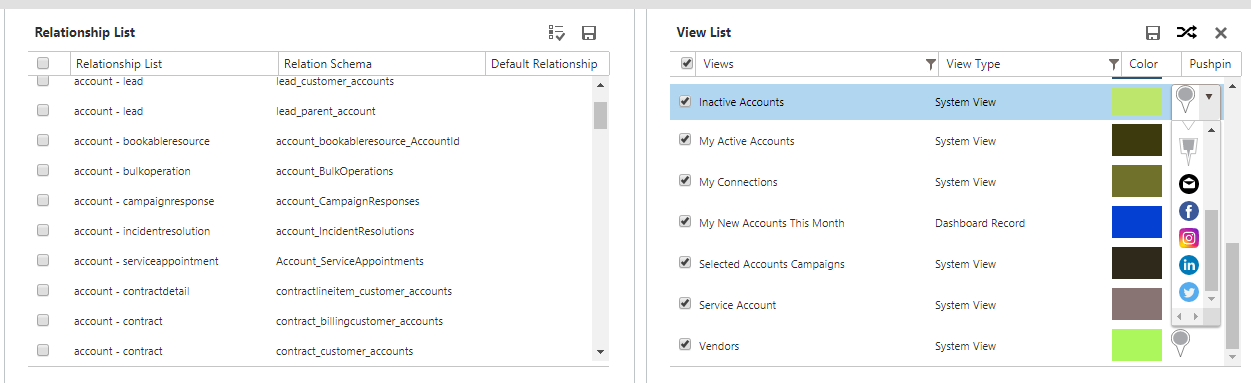
Once you have uploaded your icons for pushpins, you can assign them to different views and categories. Viewing pushpins in different colors and icons for different Entity views or categories makes them distinguishable. For defining it for different views go to Settings > Entity Maps > Open Required Entity Record > Configuration > View Configuration Section > Select your pushpins as shown below.
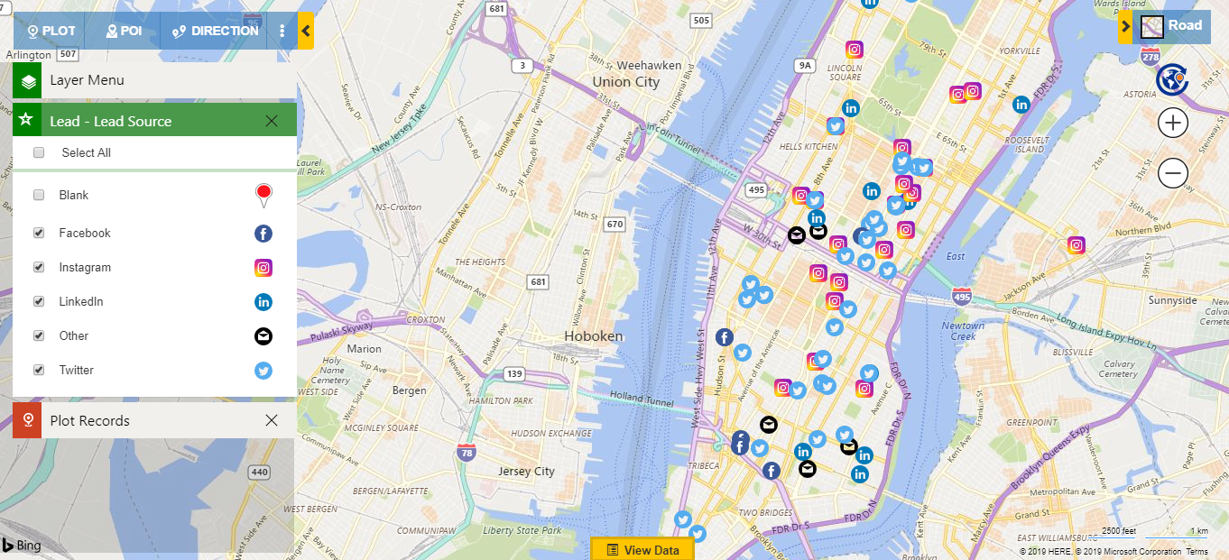
At the same time, if you have not personalized your pushpins in Maplytics Configuration then upon refreshing or replotting the color code changes. This has been changed by bringing your own icons for pushpins. You can also plot categories for an Entity by customizing the pushpins. Using .svg extension you have the option to color code your icons. Suppose you want to see the source of your Leads on map. You can create categories and plot them for social handles from where you got those Leads, whether from Twitter, LinkedIn, Instagram, Facebook or others. You can visualize the pushpins on map for better understanding. You can read this blog to get a comprehensive guide to configuring pushpins of your choice.

Once you customize your pushpins in Maplytics configuration settings you can easily understand your business requirements with your focus in alignment of the business needs. For instance, you can create custom pushpins. Let’s take a business example, say there is a scenario where you want to plot the Leads and Contacts you follow on map. If you plot it simplistically, you will get it color coded in default pushpins. If you need to change the view, the colors of the pushpins will also change randomly. There can also be a case where upon choosing a different view, the colors of Lead and Contact pushpin can get swapped. It is great to be able to still visualize data on the map, but wouldn’t it be better if you could introduce your own icons for pushpins?
By bringing your own icons for pushpins you can simply plot and visualize your data on map without much concern for the color code. You can select and customize an appropriate icon for Leads and Contacts distinctly and expedite your business.
Thus in above examples, you have seen how by personalizing your pushpins, you can ease your entire business process and create an optimized view of your data.
To explore this feature download the latest solution from our Website or Microsoft AppSource!
In case you have any queries, suggestions or want a demo, mail at crm@inogic.com
Keep Mapping, Ciao!


