In our last release we had introduced Overlay feature, which enables users to plot another layer of data over the layer of Dynamics 365 CRM records. The main motive of this feature was to enable users to visualize multiple data layers on a single map. To facilitate the same we had also introduced layer menu which helps the user to show/hide the layers of data plotted on the map.
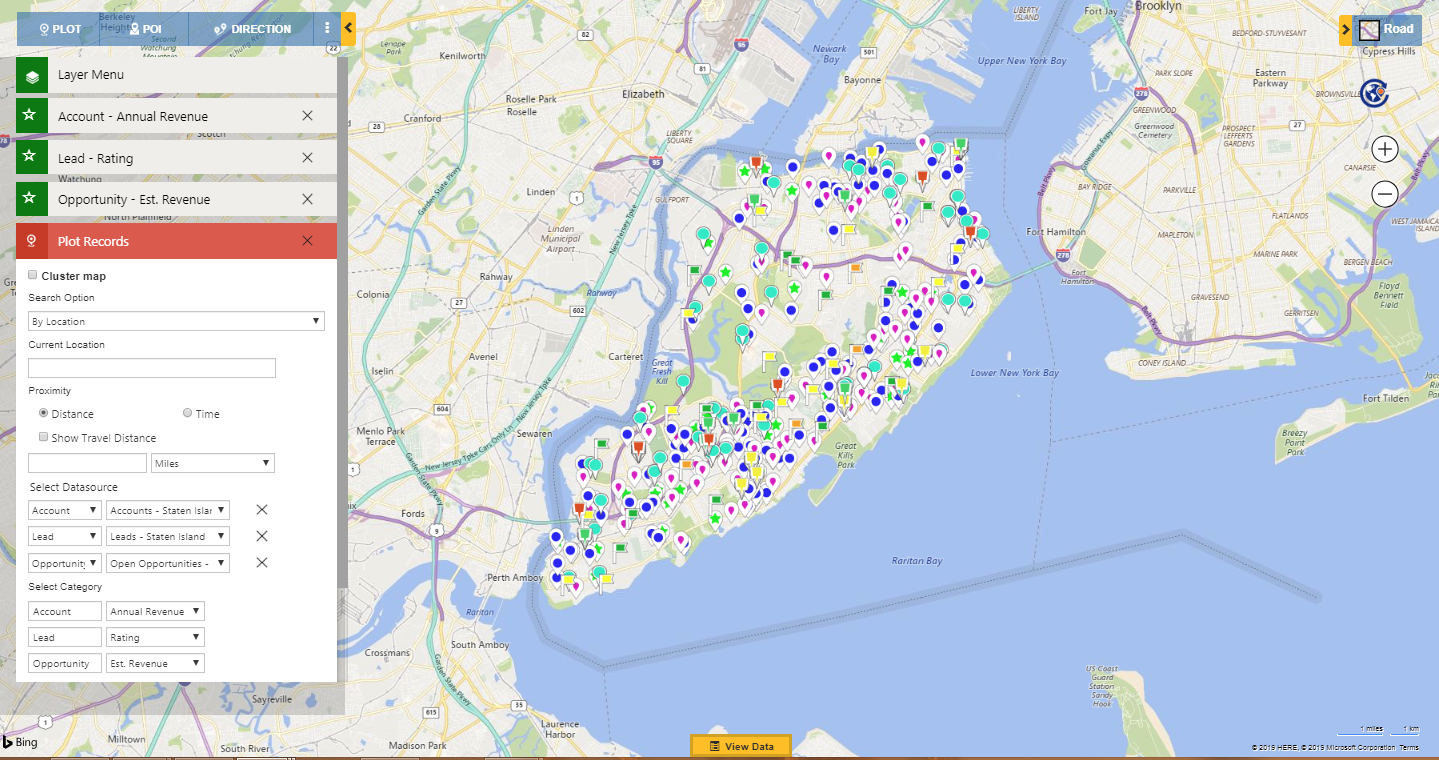
We did not stop here and with this release, we have added a new feature which enables the users to visualize the categorized data for more than one entity. Within the plot card, user can plot a maximum of three entities. Now the user will also be able to choose the categories for all the three entities.
Let’s say Ashely is the Sales Manager of her company and wants to understand the current situation of sales. She can easily plot the Categorized data for Accounts, Leads and Open Opportunities together on the same map. She can plot the Accounts categorized by Annual revenue so as to look for the revenue achieved yet. She will further plot the Leads by rating so as to have an idea of the number of hot and cold Leads. Along with this, she can plot the Open Opportunities categorized by the estimated revenue so as to know the estimated revenue that could be achieved further. In the screenshot below, she can easily see all of the three Entities plotted with the respective categories.
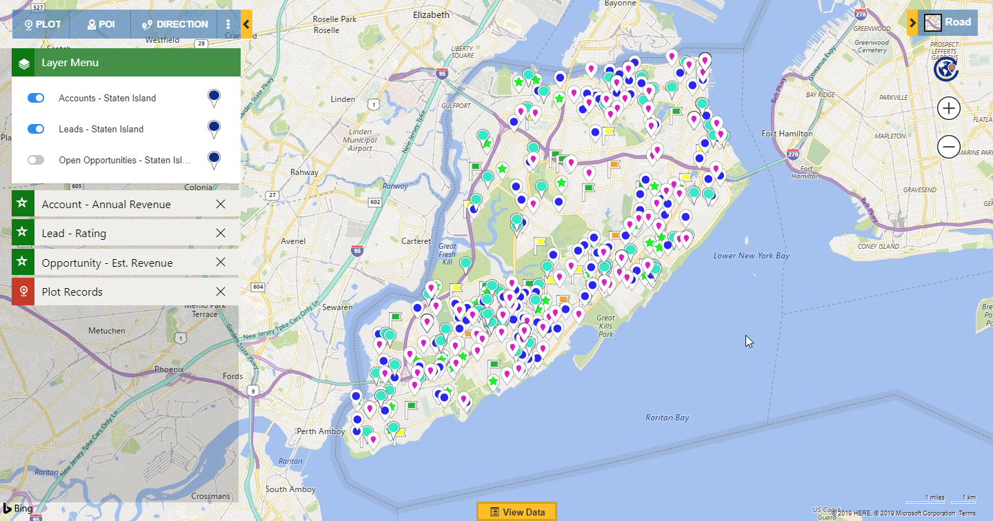
Further, she can use Layer Menu to show/hide the layers plotted on the map. This way she does not need to plot any data again and the data will always be there on the map, she can simply hide any layer to view the others and again choose to show the layer to view all the entities together.
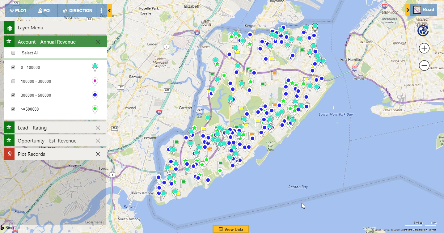
She can further use the category cards to look for the data that fall in the individual ranges created for the categories. She can easily show/hide the ranges of the categories to concentrate on only some of them.
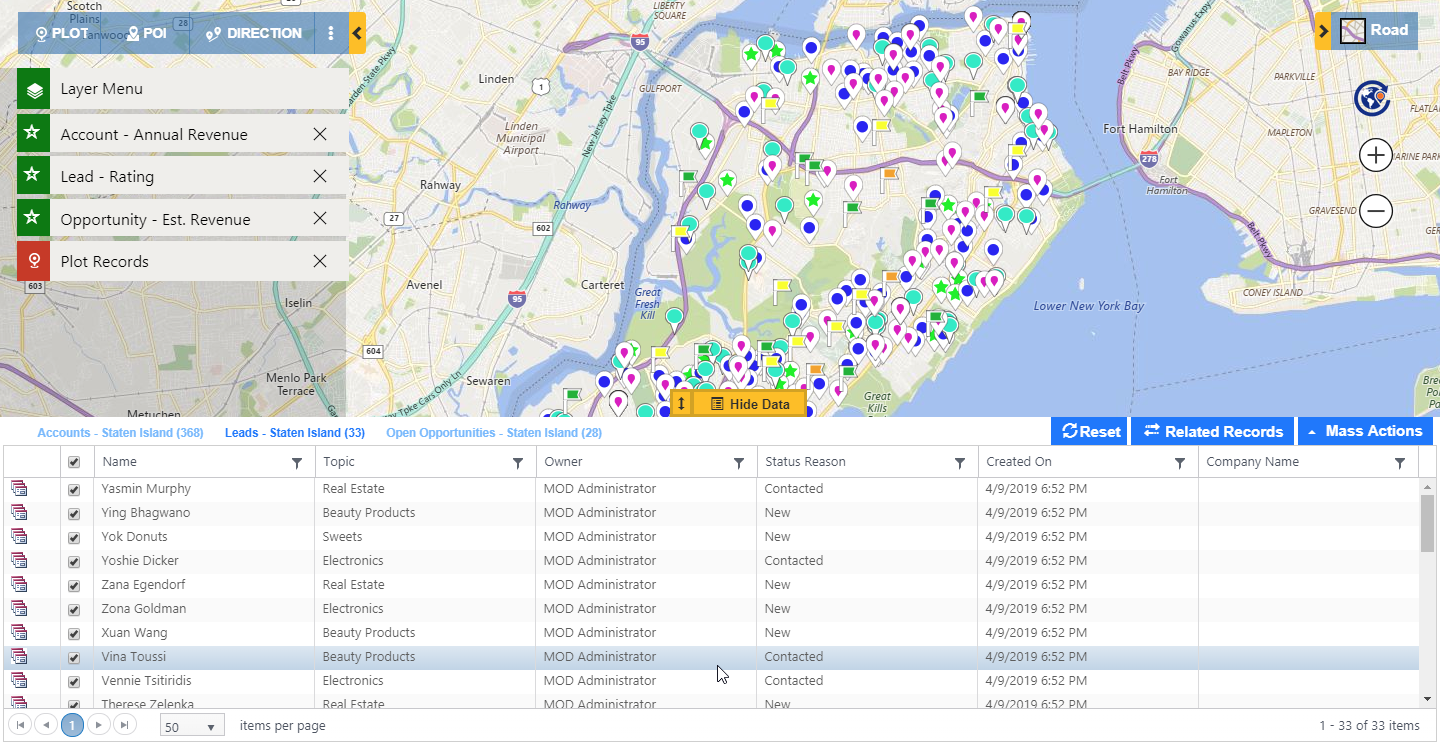
Ashley can always use the data grid to filter the data that is plotted on the map. The data grid provides the data for all the records plotted on the map which can be sorted or filtered.
In addition to this, she can also use the feature of Overlay to plot territories to understand the situation of sales for different territories.
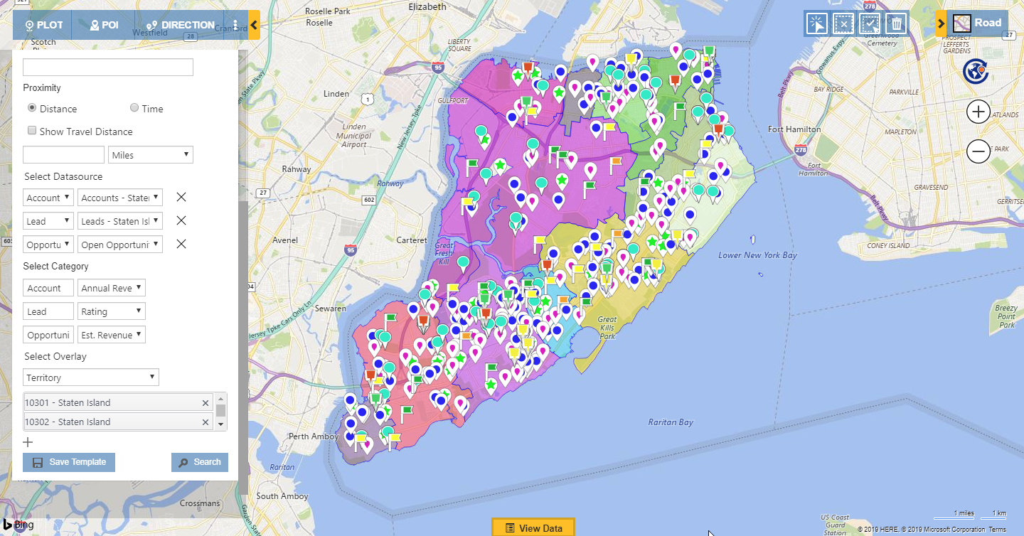
This way it has become really easy to plot multiple entity records with respective categories on the map and have a detailed analysis of the same. With the use of all of the features available within Detail map, it makes the Detail map one of the most productive platforms to visualize and analyze your Dynamics 365 CRM data.
Download the latest solution from Maplytics and start using Detail map to its optimum efficiency today. If you have not upgraded as yet, download our March release today which has PowerApps CDS Support, Census Data visualization and much more not to be missed!
Happy mapping!


