
What is data visualization on a map, and why does it matter?
Data visualization on a map means displaying business data, such as customers, leads, assets, or service requests, on a geographic map instead of in rows and columns. This allows users to see where things are happening instantly, identify patterns, and understand relationships that are difficult to spot in spreadsheets or charts. Map-based visualization makes insights more intuitive, faster to grasp, and easier to act upon.
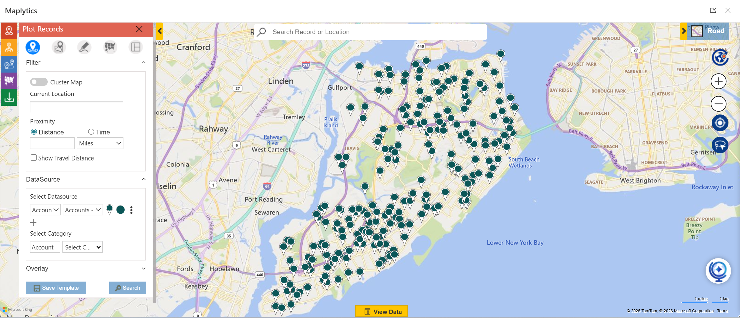
Maplytics brings CRM data directly onto interactive Azure & Bing maps, enabling users to visualize records such as accounts, leads, cases, or appointments based on their real-world locations. With layers, filters, and dynamic plotting, Maplytics turns raw CRM data into visual insights that teams can understand and use immediately, without needing advanced technical skills.
How is map visualization different from traditional CRM lists and tables?
Traditional CRM lists and tables are great for viewing details, but they lack spatial context. They show what the data is, but not where it is. Map visualization adds a geographical layer, helping users spot clusters, gaps, overlaps, and locational trends at a glance, something lists simply cannot reveal.
With Maplytics, users can move seamlessly from CRM grids to map views, plotting thousands of records visually. Sales teams can see territory coverage, service teams can identify nearby jobs, and managers can instantly assess regional performance, without scrolling through endless lists.
Why is geographic context important for business data analysis?
Geographic context helps businesses understand how location influences performance, cost, and opportunity. Factors like distance, travel time, regional demand, and proximity to customers all affect decisions. Without geographic insight, businesses risk missed opportunities, inefficient routes, and uneven resource distribution.
Maplytics adds geographic intelligence to CRM data by enabling proximity searches, travel-time analysis, territory visualization, and route planning. By combining real-time location data with CRM records, Maplytics helps organizations make smarter, faster decisions that are grounded in real-world geography.
Geo-Mapping CRM Data
How can CRM records, such as accounts, leads, opportunities, and cases, be visualized on interactive maps, and what insights does geographic visualization reveal?
Let’s see.
Traditional CRM views, like lists and charts, often miss the geographic context behind business data. 80% of the data has a locational factor associated with it, which could be utilized for accurate data analysis and decisions. When CRM records such as accounts, leads, opportunities, and cases are visualized on interactive maps, teams can quickly spot regional trends, high-performing areas, territory gaps, customer clusters, and service demand patterns. Geographic data visualization makes it easier to understand sales performance by location, optimize territories, improve route planning, and make more informed, location-based decisions.
Maplytics brings this capability directly into CRM by plotting records on interactive maps with census markers, heatmaps, and territory layers. Users can apply filters, perform radius searches, and analyze data by region to gain real-time location intelligence. By combining CRM mapping, territory management, and spatial analysis, Maplytics helps sales and service teams turn raw CRM data into clear, actionable geographic insights that drive efficiency and growth.
Acquiring Enhanced Insight & Decision Making
Map visualization helps identify high-value regions, uncover performance patterns that spreadsheets often miss, prioritize sales and service actions based on location, and use clustering and heatmaps to better understand customer distribution and demand.
Here’s how.
Business data tells part of the story, but geography often reveals the why behind performance. When data is visualized on a map, patterns become easier to spot at a glance. High-value regions stand out based on customer density, revenue concentration, or service demand. Unlike spreadsheets that require constant filtering and comparison, map visualization shows trends visually, helping teams quickly understand where opportunities are growing, where performance is lagging, and how location influences outcomes. Mapping also makes it easier to prioritize sales visits, service coverage, and resource allocation by highlighting areas that need immediate attention based on proximity, workload, or potential impact.
Maplytics brings this geographic clarity directly into CRM by plotting customers, leads, opportunities, and activities on interactive maps. With features like clustering and heat maps, teams can instantly see customer concentration, revenue hotspots, and service-heavy zones. Territory boundaries, proximity insights, and real-time data overlays help sales and service teams focus their efforts on the right regions at the right time. By turning raw CRM data into clear visual insights, Maplytics enables faster decisions, smarter planning, and more targeted actions driven by location intelligence.

Understanding Business Use Cases
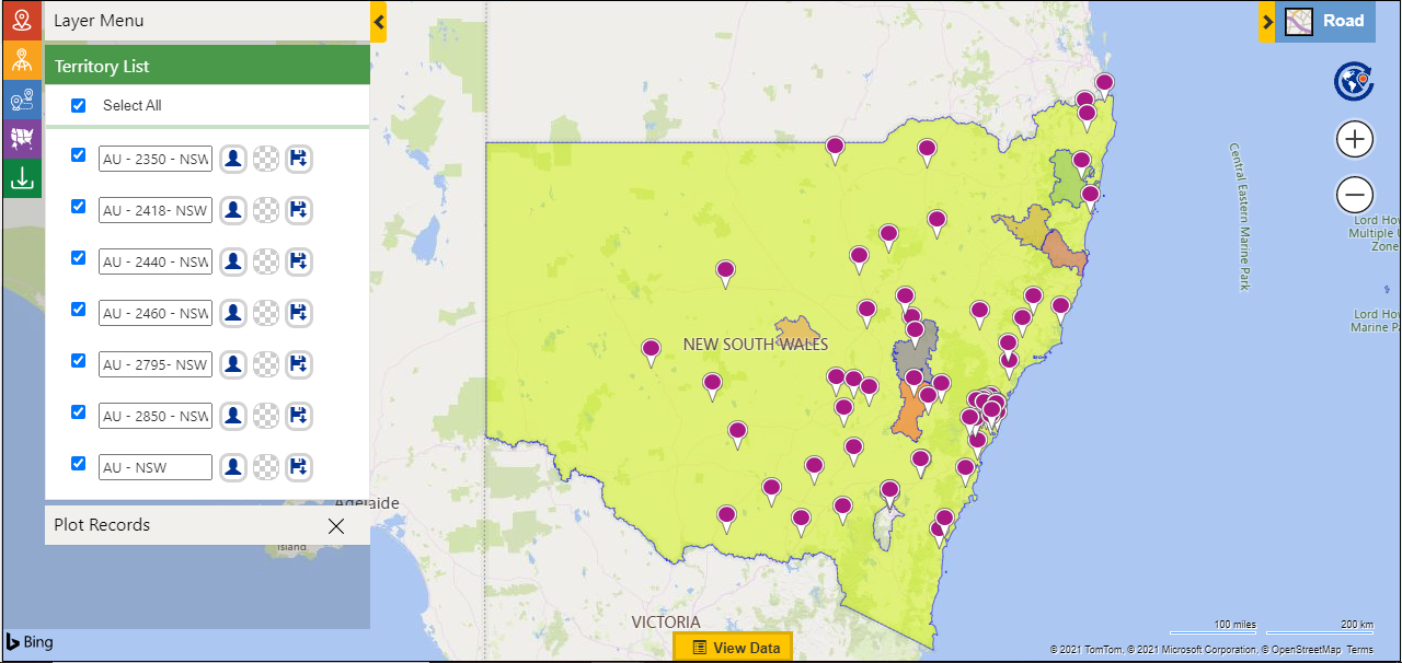
How can map visualization help sales managers and service teams plan territory coverage, gain insights from work orders, identify underserved or overserved areas, and improve forecasting and trend analysis?
Location context adds a powerful layer to business planning that traditional reports often miss. When sales and service data are visualized on a map, leaders can clearly see how teams, customers, and demand are distributed across regions. This makes it easier to design balanced territory coverage, avoid overlap, and ensure no high-potential area is overlooked. For service teams, mapping work orders highlights travel patterns, workload density, and response coverage, helping identify areas that are underserved or overburdened. Over time, these visuals also support better forecasting and trend analysis by revealing regional growth patterns, recurring service demand, and shifts in customer behavior that are difficult to spot in spreadsheets alone.
Maplytics enables this level of insight by transforming CRM data into interactive map visualizations. Sales managers can view and adjust sales territories, analyze account distribution, and ensure fair coverage using real-time geographic insights. Service teams can plot work orders, cases, and appointments to optimize coverage areas and improve response planning. With features like territory mapping, clustering, heat maps, and historical or real-time ESRI data overlays, Maplytics helps organizations identify gaps, predict demand, and make data-driven decisions based on location intelligence.

Contribution to Operational Efficiency
How does data visualization on maps simplify manual data interpretation while helping sales reps plan daily visits more effectively and highlighting the benefits of visual route planning over manual scheduling?
Data visualization on maps makes complex data easier to understand by turning rows of numbers and lists into clear visual patterns. Instead of manually scanning spreadsheets or switching between reports, teams can instantly see where customers, leads, and activities are located, which areas need attention, and how locations relate to each other. This visual clarity reduces mental effort, speeds up interpretation, and helps sales reps quickly decide where to go and whom to meet each day. Compared to manual route scheduling, visual route planning shows distance, proximity, and travel flow at a glance, making daily visit planning faster and far more practical.
From a thought leadership perspective, the shift from manual analysis to visual decision making is no longer optional. Sales productivity today depends on minimizing planning time and maximizing time in the field. Organizations that rely on visual route planning empower their teams to focus on selling rather than logistics, enabling smarter decisions in real time instead of reactive adjustments later.
Maplytics brings this approach directly into CRM by visualizing accounts, leads, and activities on interactive maps. Sales reps can view nearby customers, plan optimized routes with multiple stops, and adjust visits visually instead of manually scheduling each trip. With built-in route optimization and proximity search, Maplytics helps teams plan efficient daily visits, reduce travel time, and make location-based decisions faster and more accurately, all within their existing CRM workflow. What is unique is the detailed turn-by-turn navigation steps provided and the ability visualize these on Google Maps, Apple Maps, or Waze makes it even more appealing.

Advanced Map Features & Insights
How do heat maps, proximity search, and multi-layer data visualization work to enhance CRM insights and performance analysis on interactive maps?
Heat maps, proximity search, and multi-layer visualization turn CRM data into visual intelligence that is easier to analyze and act on. Heat maps highlight density patterns such as high-revenue zones or lead concentration, while proximity/radius search and POI Location Search help identify nearby customers, opportunities, or service requests based on location. Multi-layer data visualization allows different CRM attributes like revenue, opportunity stage, or lead source to be viewed together, revealing trends and performance patterns that are difficult to detect in traditional reports.
From a strategic perspective, combining multiple visual layers helps organizations move from reactive reporting to proactive performance analysis. When location data is visualized contextually, teams can quickly identify high-performing regions, gaps in coverage, and growth opportunities.
Maplytics enables this by offering interactive heat maps, radius and proximity search, and layered CRM data visualization directly within the CRM. Users can overlay sales performance, territories, activities, and customer data on a single map to gain deeper insights, analyze regional performance, and make data-driven decisions faster.
AI & Interactive Visualization
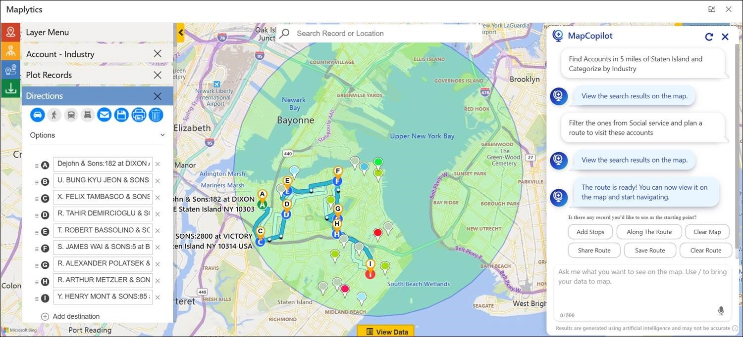
How can conversational AI and natural language map queries be used to visualize CRM data on maps while delivering faster and predictive insights from geographic trends?
Conversational AI simplifies access to CRM insights by allowing users to interact with maps using natural language instead of complex filters or manual searches. Natural language map queries make it possible to instantly visualize CRM data by asking simple questions, which speeds up insight discovery and reduces dependency on technical skills. Over time, geographic data patterns can also support predictive insights related to demand, workload, or customer behavior.
As AI becomes a core part of business intelligence, the ability to ask questions in everyday language represents a major shift toward intuitive analytics. This approach empowers more users to explore data independently and make faster decisions.
Maplytics delivers this through MapCopilot, an AI-powered assistant that understands natural language prompts. Users can ask queries like finding nearby leads or viewing opportunities in a specific region, and MapCopilot instantly plots the results on the map. Users can plot routes instantly and view them on the map with simple instructions. This combination of conversational AI, CRM mapping, and location intelligence enables faster insights and smarter geographic analysis.
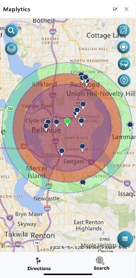
Mobile & Field Team Scenarios
How does mobile map visualization help field teams make real-time decisions, plan and execute work on the go, and quickly locate the nearest customers or service requests?
Mobile map visualization provides field teams with real-time access to location-based CRM data, helping them make informed decisions while on the move. By visualizing customers, appointments, and service requests on a map, reps can quickly adjust plans, locate the nearest stops, and respond to changes without returning to the office or switching tools.
From an operational standpoint, mobility is essential for field productivity. Real-time access to maps and CRM data ensures that teams remain agile, reduce delays, and maximize the number of productive visits each day.
Maplytics supports mobile users by offering map visualization, route planning, proximity search, and real-time CRM data access on mobile devices. Field teams can find nearby customers, optimize routes, and execute daily tasks efficiently, all while staying connected to live CRM updates.
Performance & Results
How does visualizing CRM data on interactive maps improve team productivity, deliver measurable business outcomes, reduce operational costs, and enhance customer satisfaction?
Visualizing CRM data on interactive maps transforms complex information into clear, location-based insights that teams can understand and act on quickly. Instead of spending time interpreting spreadsheets or static reports, users can instantly see customer distribution, sales activity, service coverage, and performance patterns on a map. This clarity helps teams plan better routes, prioritize tasks by location, and reduce time spent on manual analysis, which directly improves productivity.
From a strategic viewpoint, geographic visualization connects day-to-day actions with measurable business outcomes. When organizations understand where revenue is coming from, where service demand is highest, and where inefficiencies exist, they can allocate resources more effectively. This leads to lower travel and operational costs, faster response times, and more consistent service delivery, all of which contribute to higher customer satisfaction.
Maplytics makes this possible by enabling interactive map visualization of CRM data such as accounts, leads, opportunities, activities, and territories. With features like route optimization, proximity search, heat maps, and territory management, Maplytics helps teams work smarter, reduce unnecessary travel, and focus on high-value areas. The result is improved team efficiency, better decision-making, reduced costs, and a more responsive and satisfying customer experience.
Integration & Ease of Use
How easy is it to connect CRM data with interactive map visualization tools? Does it require technical expertise or coding skills, and how does real-time synchronization between CRM updates and map views improve accuracy?
Modern map visualization tools are designed to integrate seamlessly with CRM systems, making it easy to connect data without requiring extensive technical expertise or coding. Real-time synchronization ensures that any updates made in CRM are instantly reflected on maps, maintaining accuracy and consistency across planning and execution.
From a usability standpoint, low-code and no-code integration play a critical role in adoption. When data stays synchronized automatically, teams can trust the insights they see and act with confidence.
Maplytics integrates directly with CRM and requires minimal configuration to get started. It automatically syncs CRM records with map views in real time, ensuring accurate visualization of accounts, leads, activities, and territories. This real-time data synchronization helps teams rely on up-to-date insights while planning routes, managing territories, and making location-based decisions.